aiga new york
Repositioning and redesigning the identity of the largest
chapter of the American Institute of Graphic Arts.
-
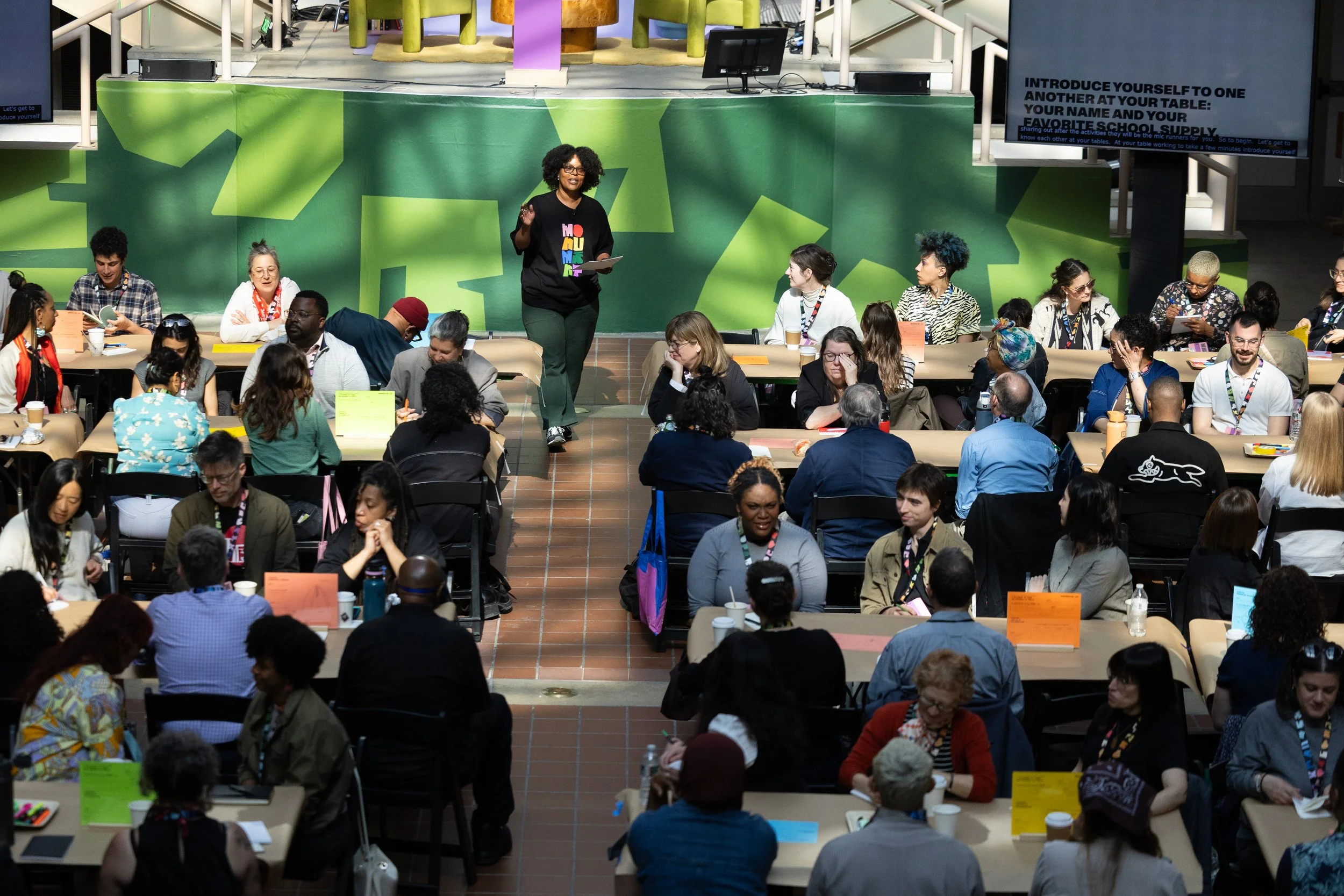
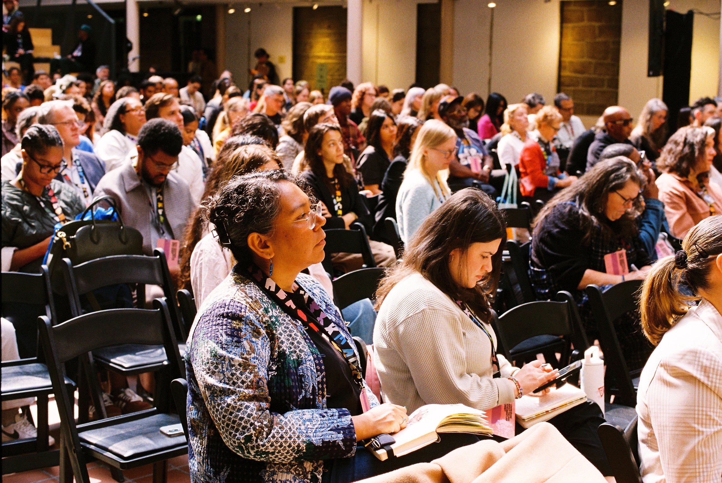
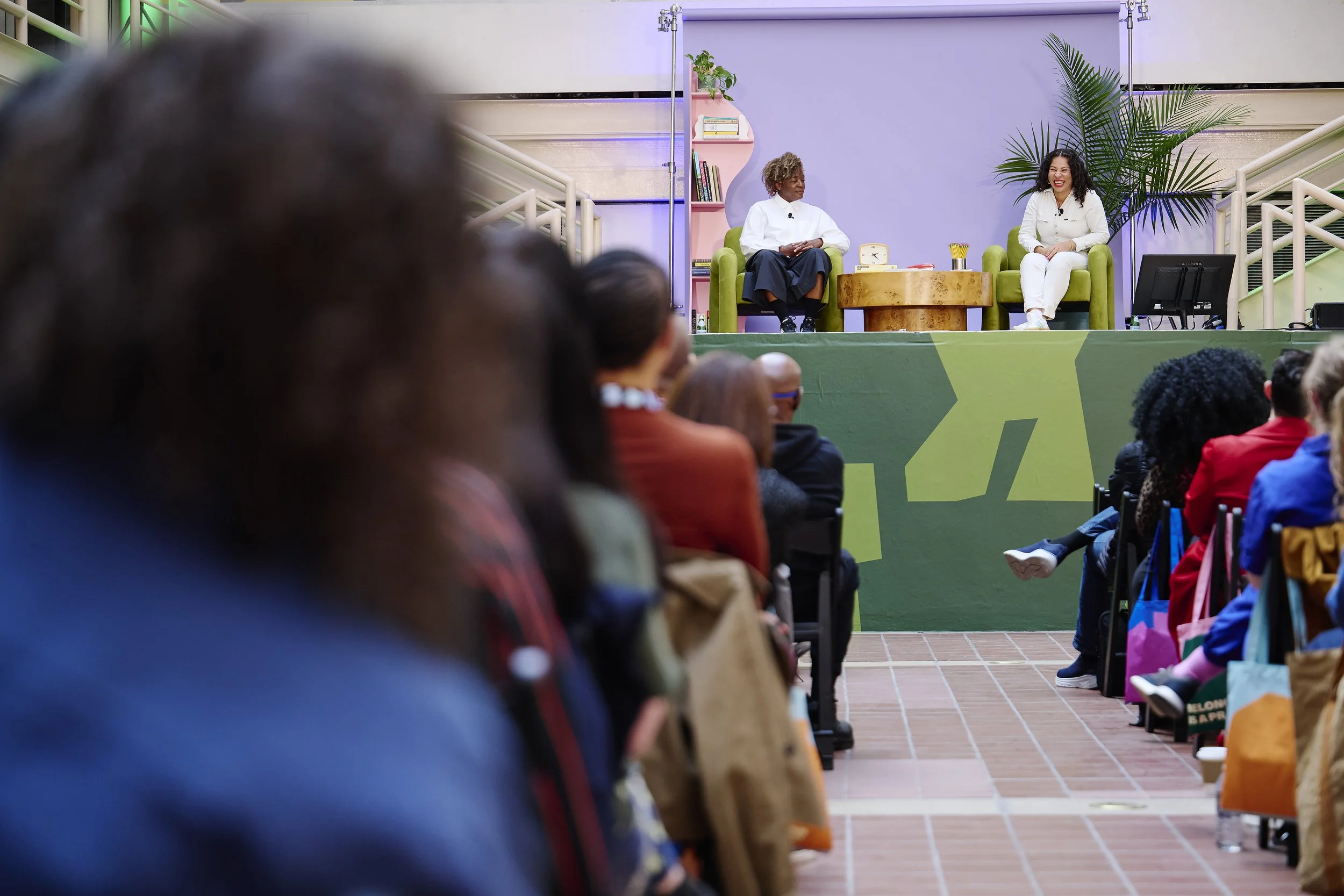
AIGA NY assembled a brand taskforce of board members to refine the next chapter of the organization’s evolution. Through qualitative research, we gained a better understanding of the perception shifts needed to drive emotional connection, membership, and sponsorship. There was a fundamental gap in how the community saw us — a heavily resourced institution — and the reality of our non-profit, volunteer-driven status. We also discovered that many didn’t know the range of our work beyond programming, giving us an opportunity to showcase the important work we’re doing, positioning AIGA NY as a resource and advocate for all.
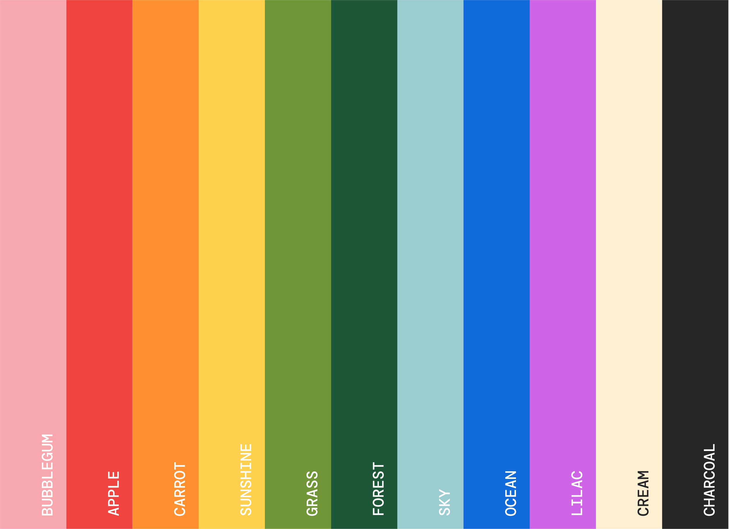
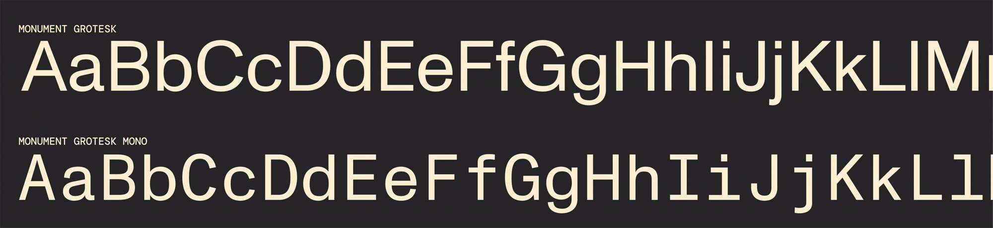
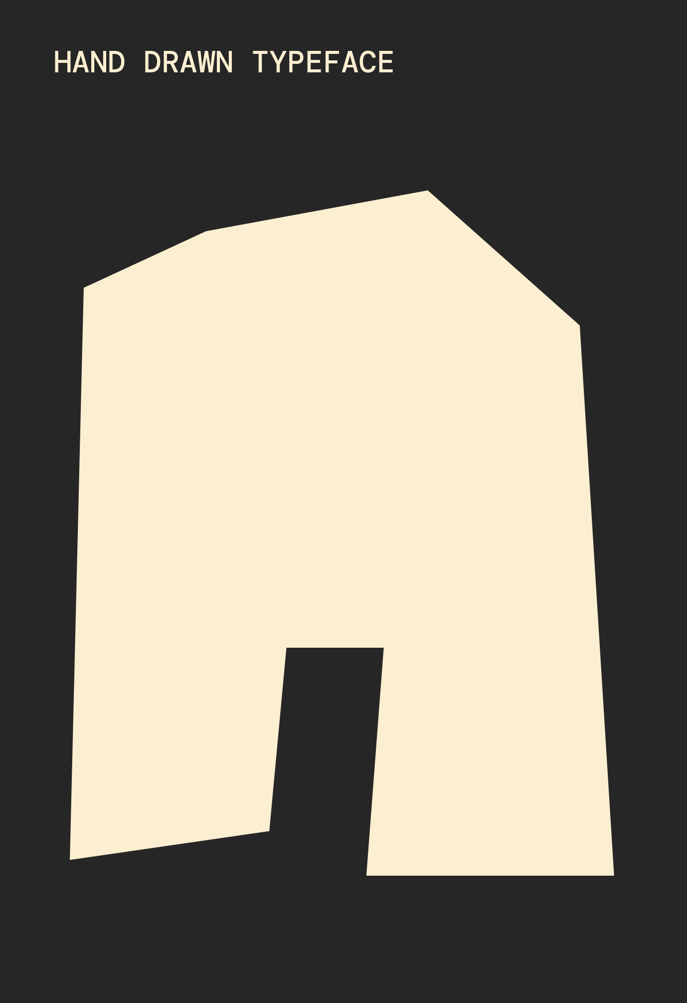
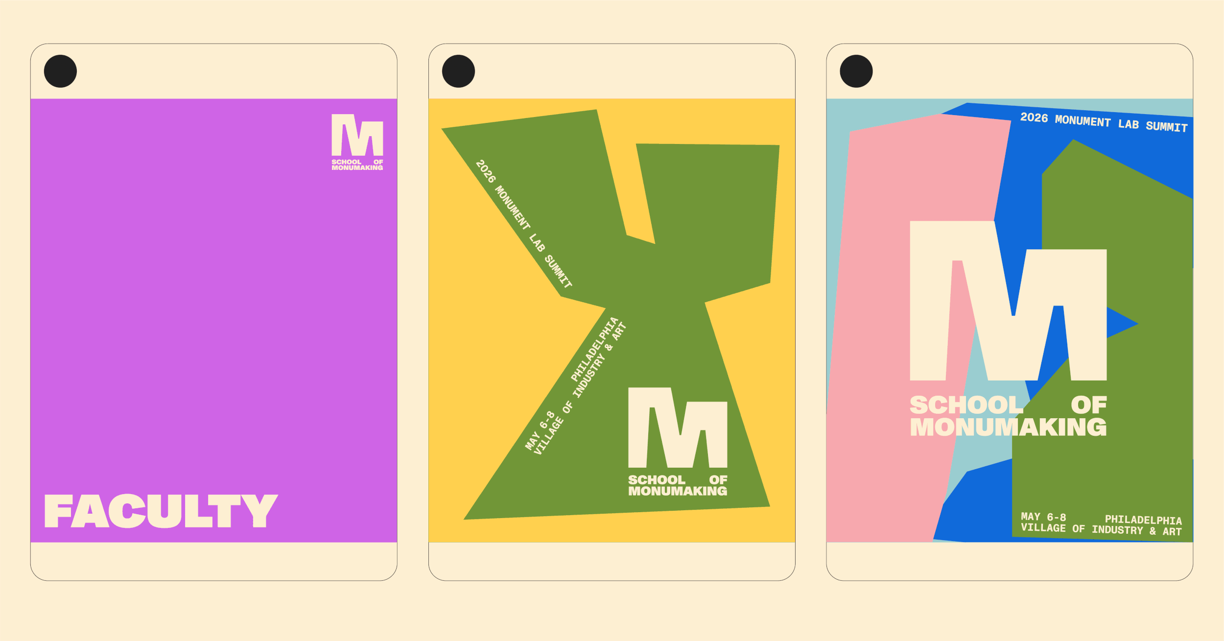
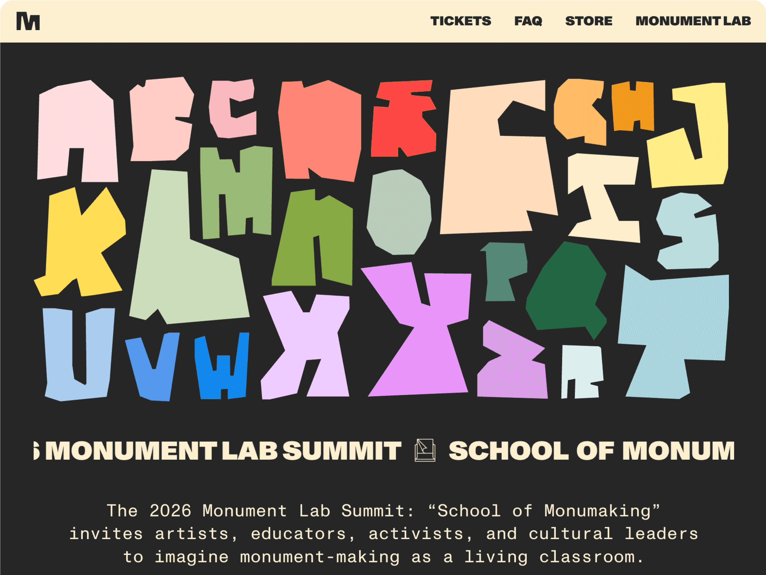
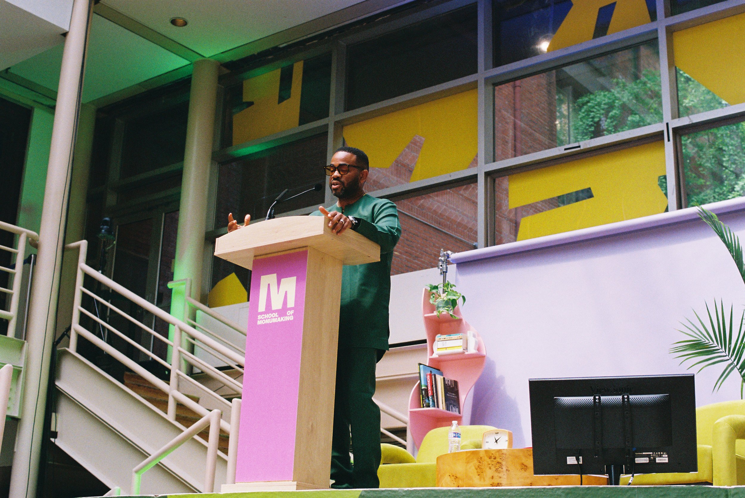
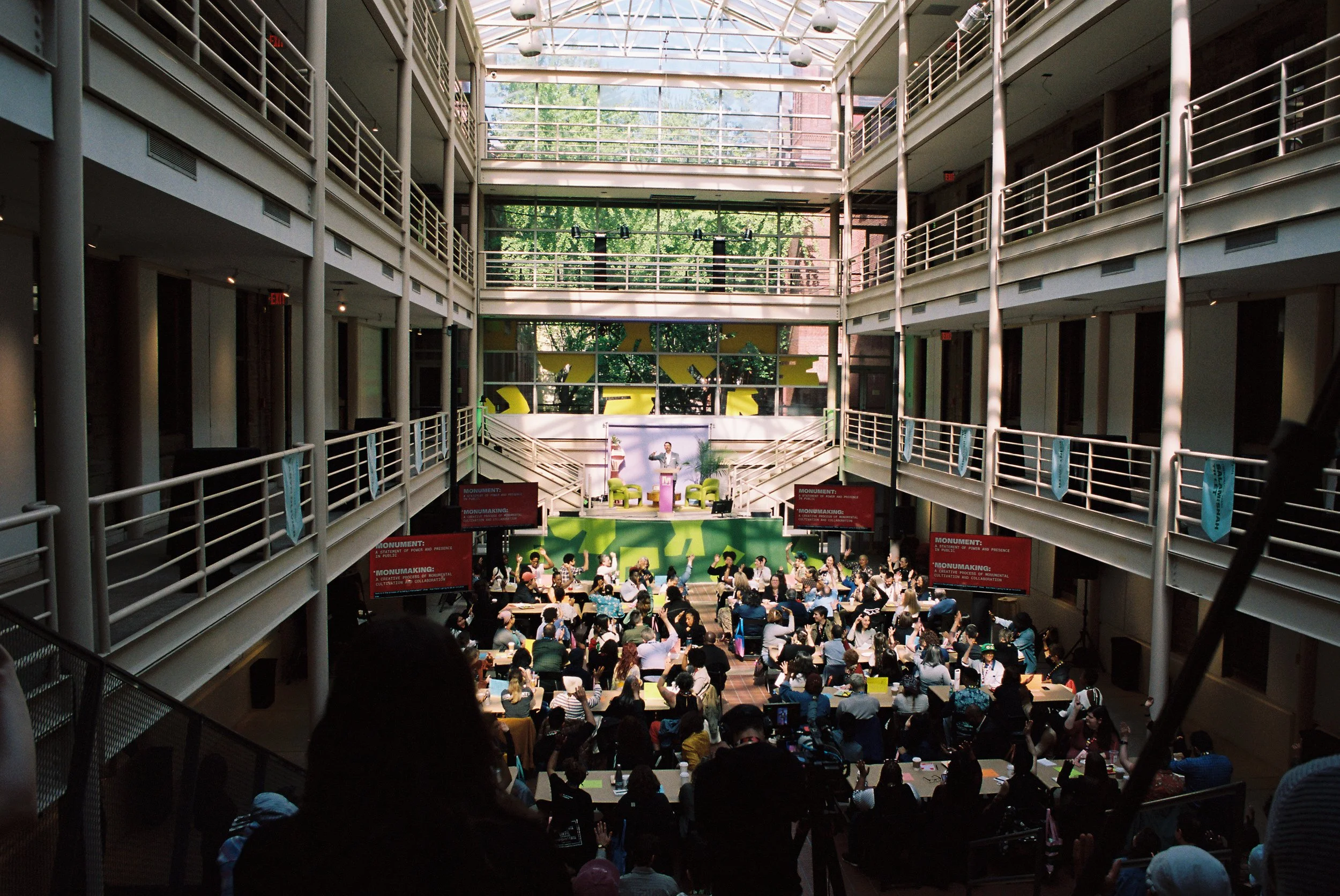
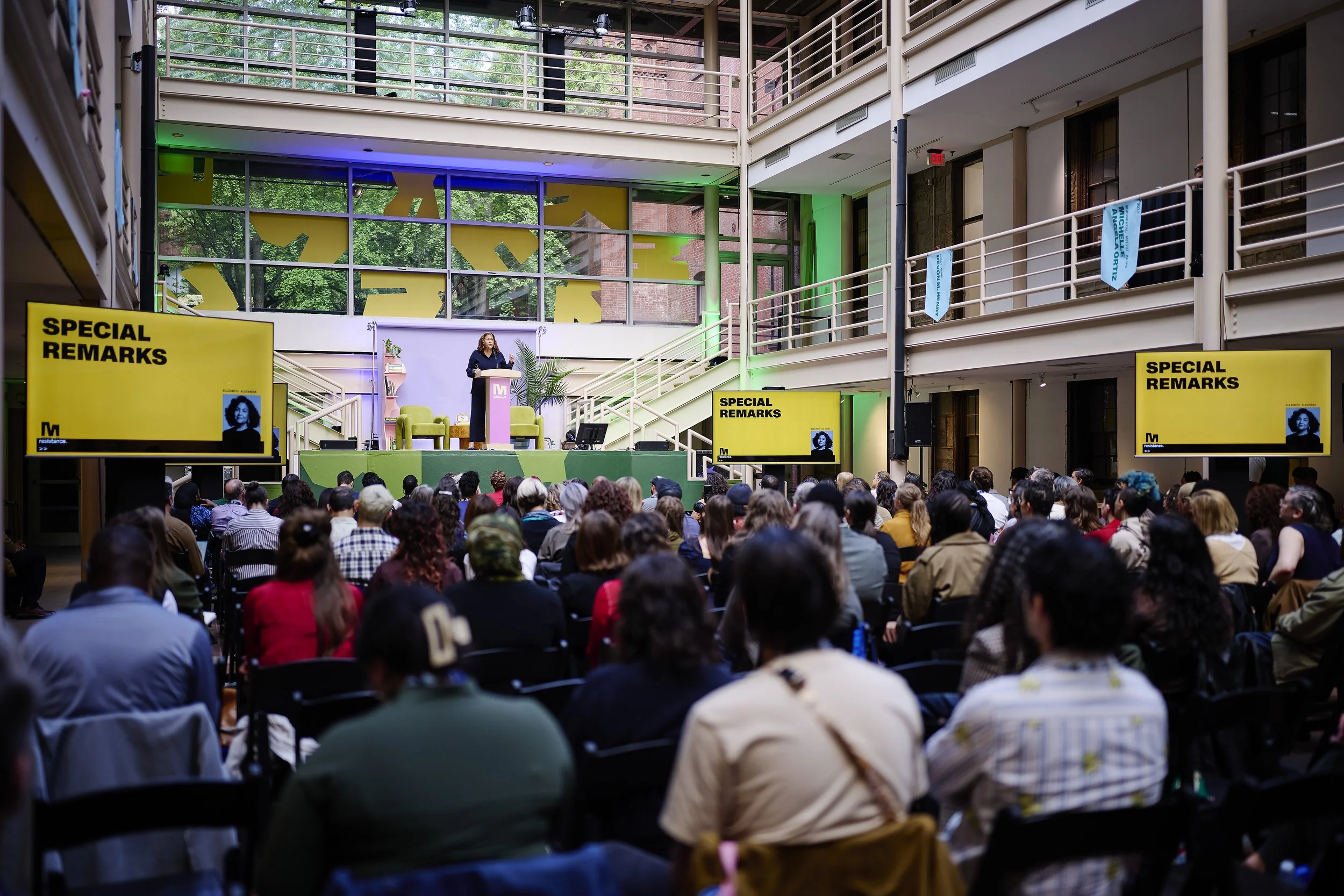
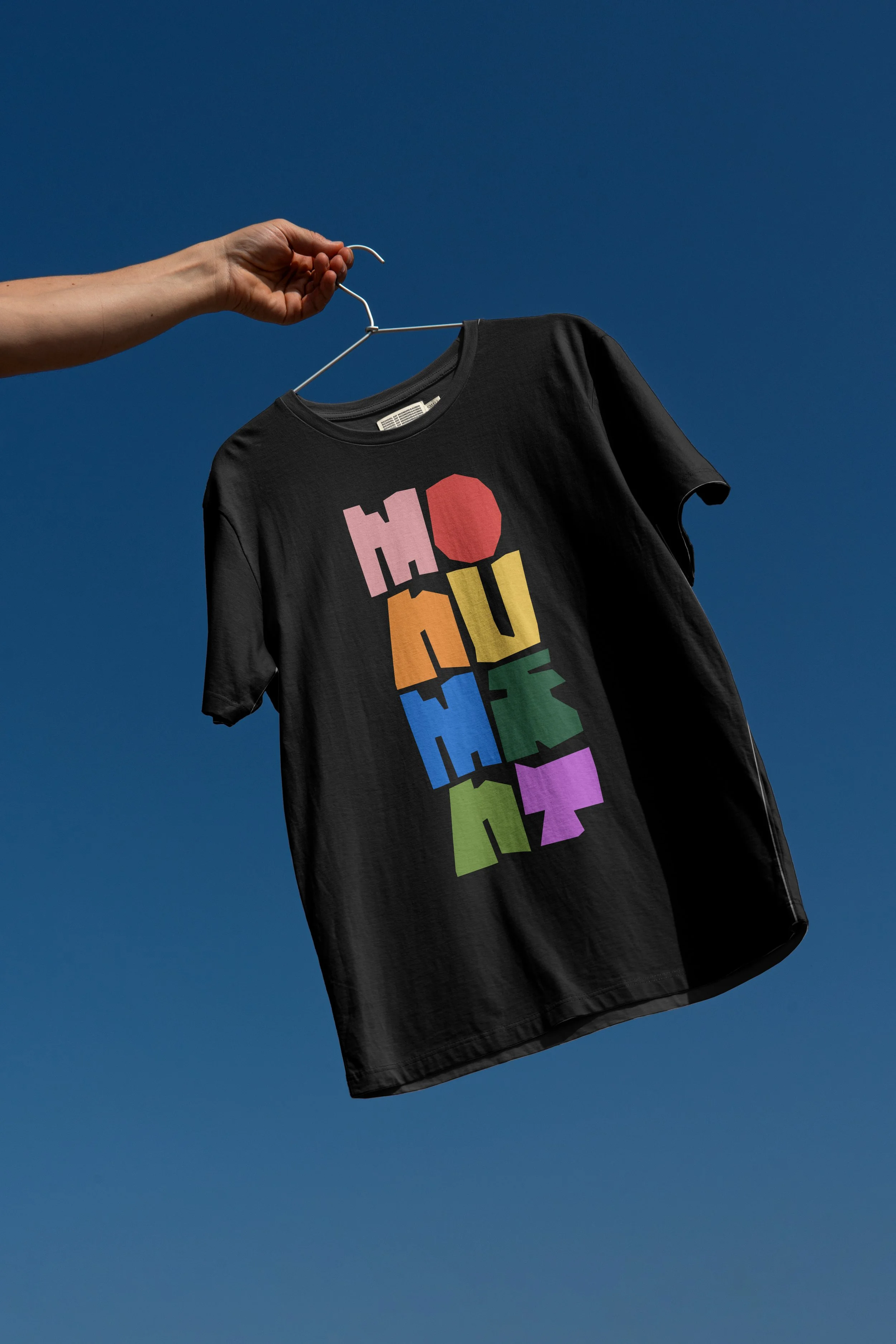
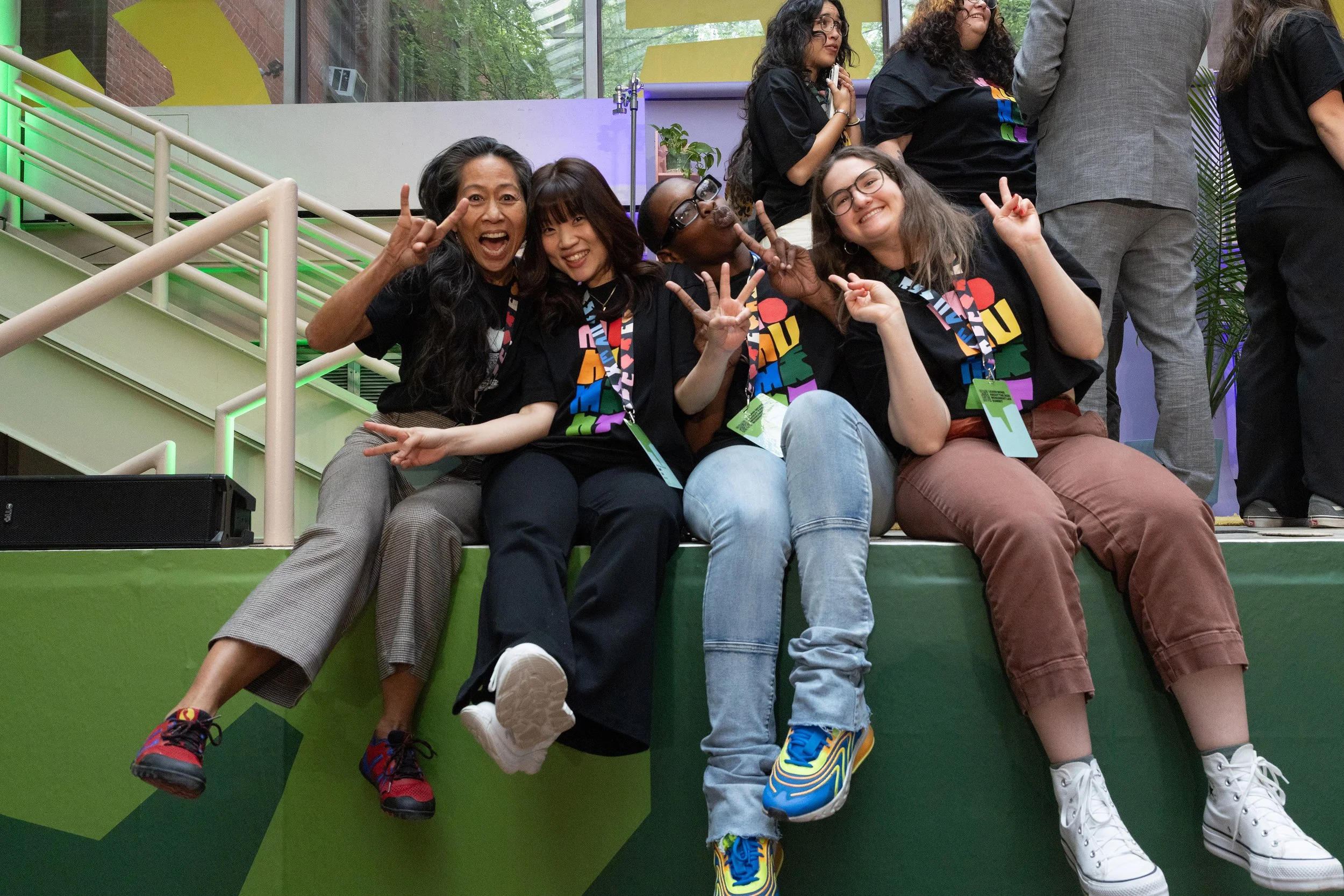
With a refreshed strategy and verbal identity, our creative leads, Chris Guerrero and Raven Mo, created an identity that felt true to the mission: championing the future of design for all. The logo was designed with flexibility and dynamism in mind, seamlessly interacting with imagery and type. The negative space in the key art creates what we call the townsquare, because AIGA NY is a place where all can be seen and heard. The color palette pulls from the beautiful mundanity of the city — the green scaffolding, the charcoal pavement, the off-white sidewalks. Combined, this visual and verbal system clarifies the organization’s position as a civic design space, encouraging open and honest dialogue within the design community.
SERVICES:
strategy
brand identity
digital designROLE + TEAM:
Ana Rice, design lead
Archie Bell, II, strategy
Chris Guerrero, design lead
David Perrin, strategy
Ella Dobson, strategy + motion
Heather-Mariah Dixon, strategy
Naeiri Zargarian, strategy
Nicole Motta, strategy
Raven Mo, type leadYEAR:
2026PRESS:
2026