FARMACY BEAUTY
Refreshing the identity and art direction
of a farm-grown, lab-proven beauty brand.
-
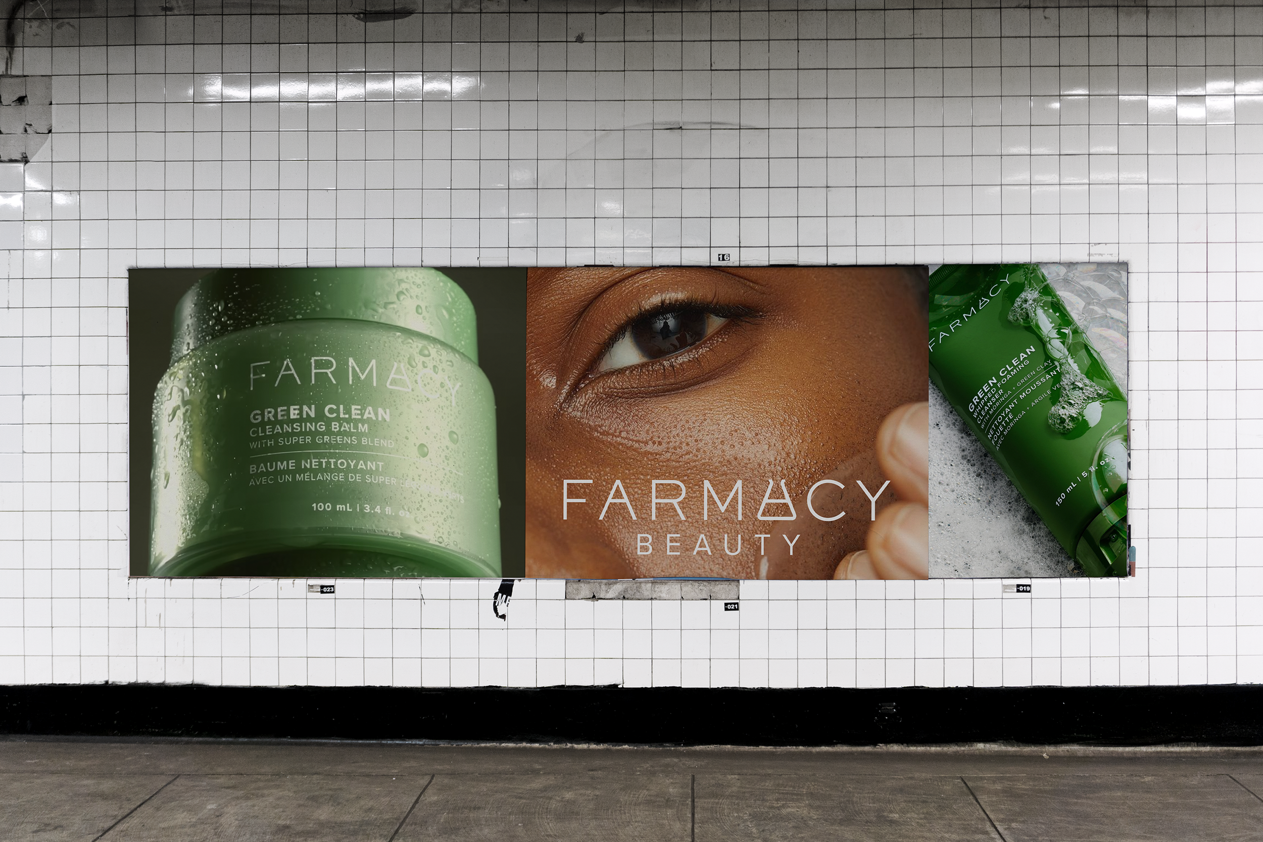
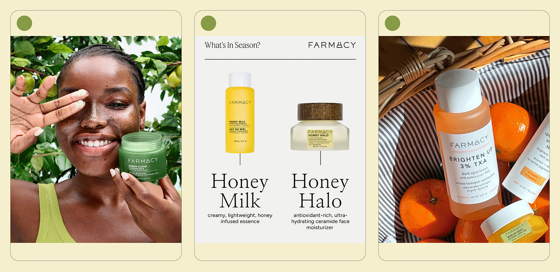
In an oversaturated market, Farmacy was fighting to make noise. They needed to be clear about what made them unique, communicate that value, and reengage their audiences. Their products are the best of both worlds — formulations from farm-grown ingredients enhanced by potent science actives for clinically proven results.
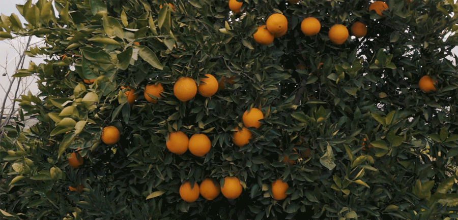
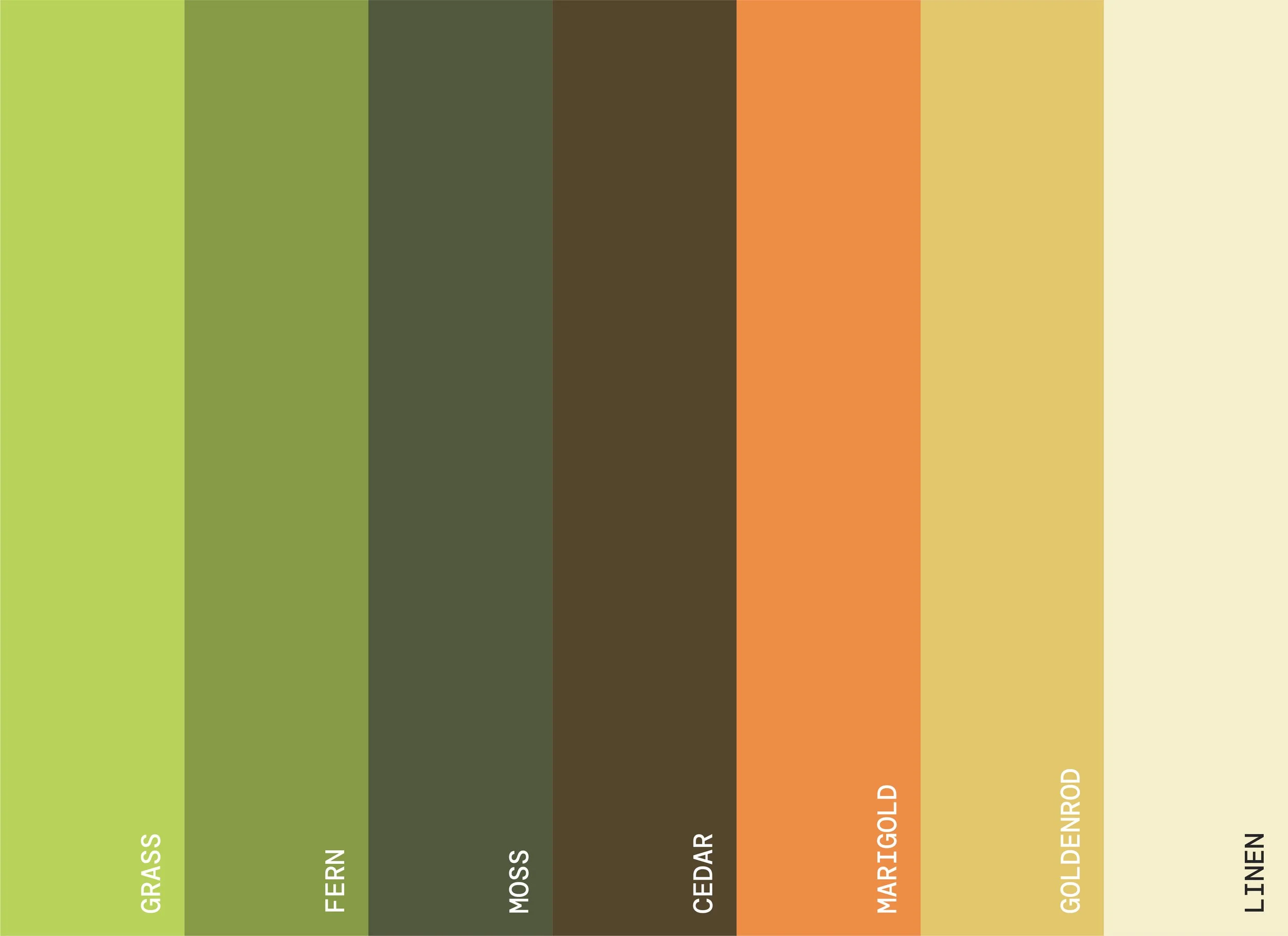
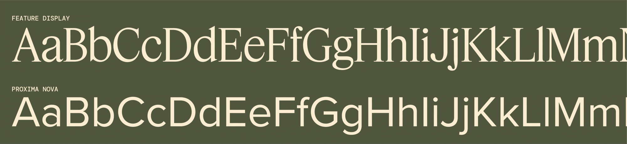
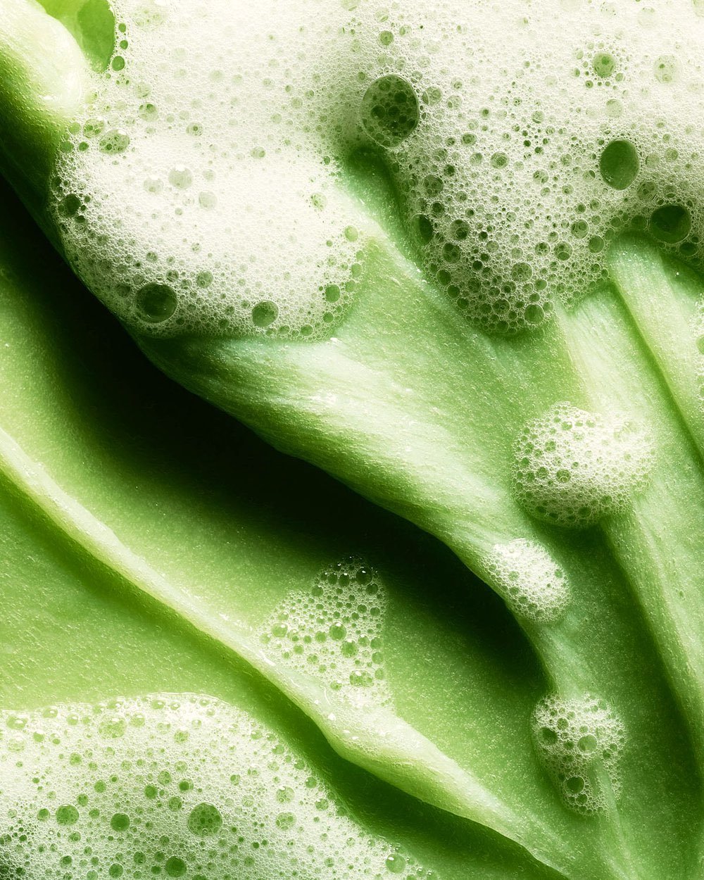
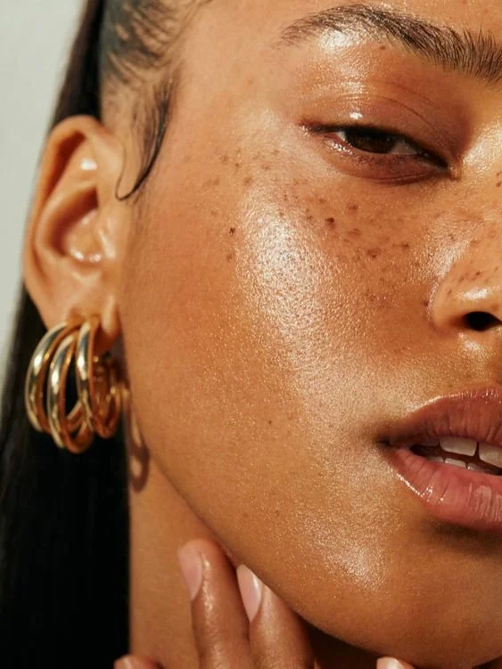
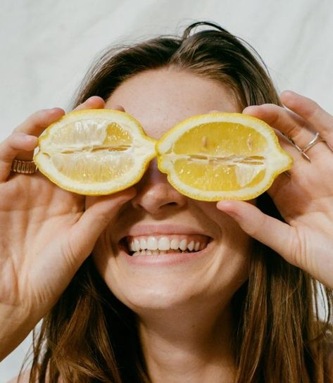
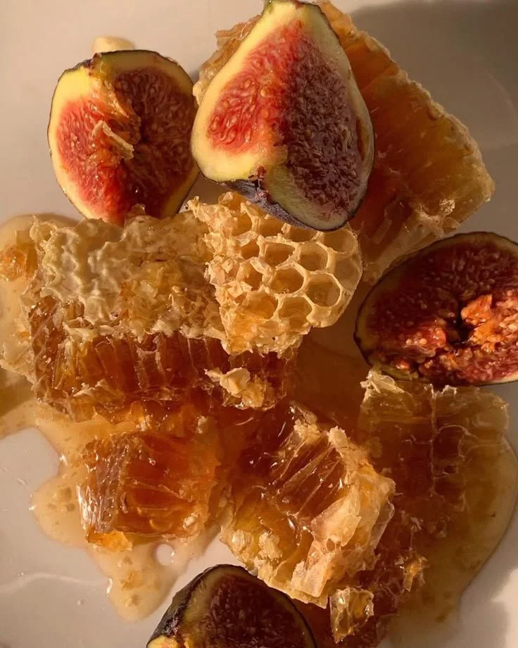
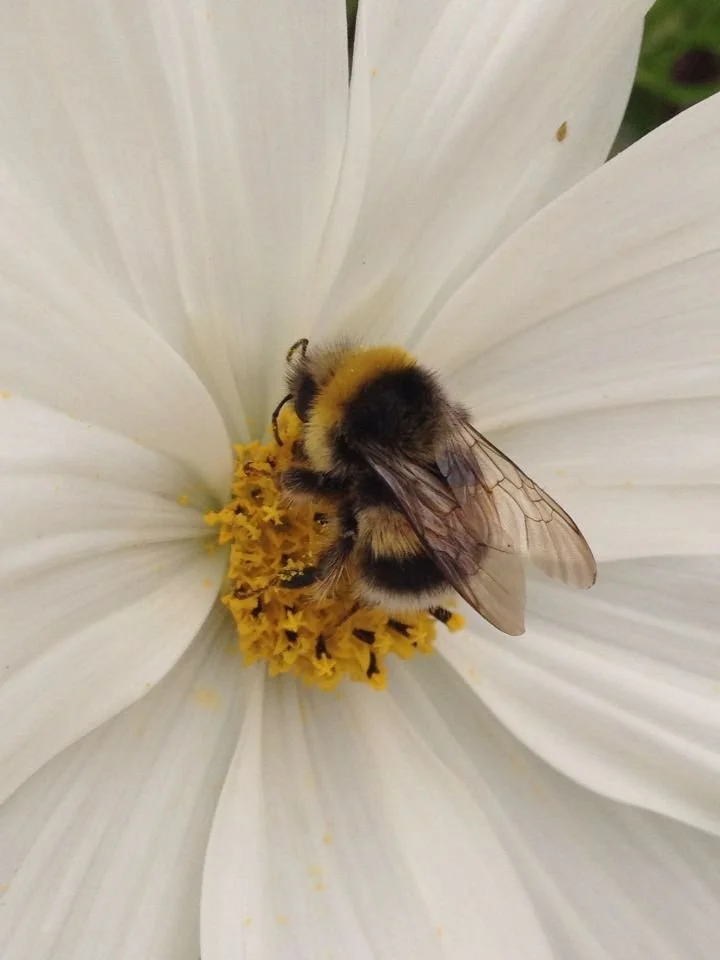
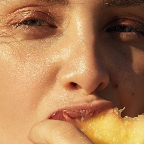
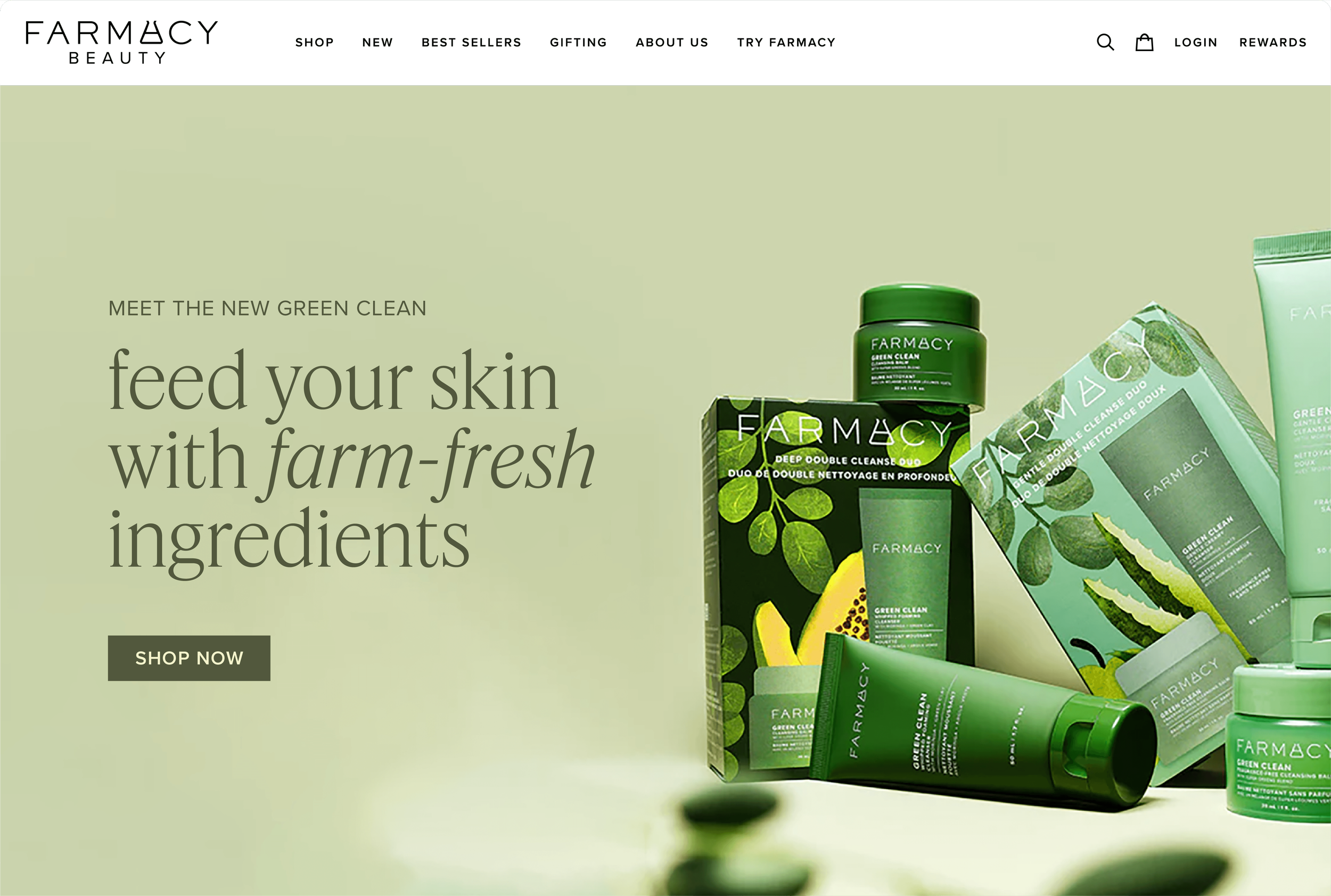
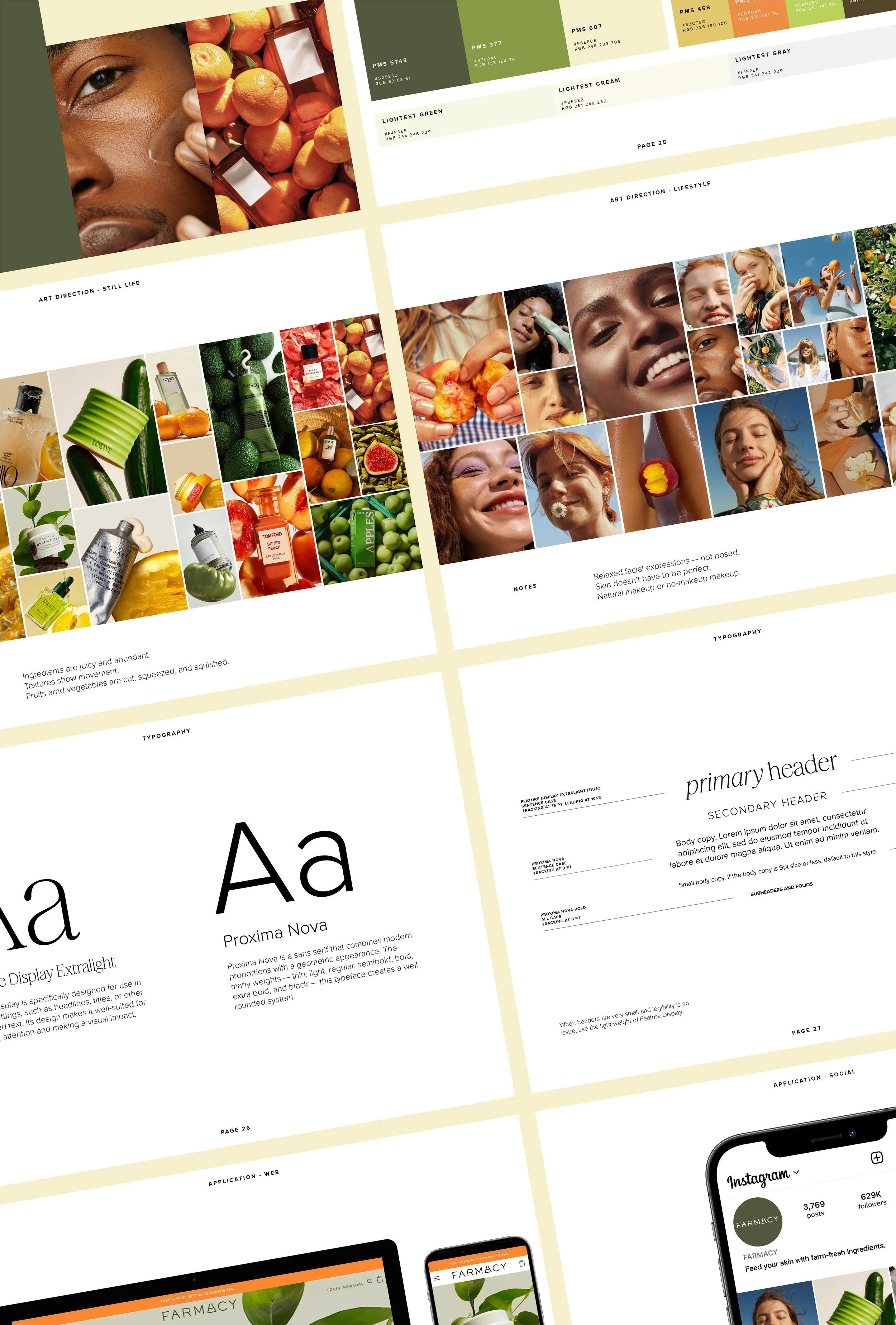
With a refreshed brand strategy, I crafted a visual identity to reintroduce the brand to the beauty landscape. The reimagined art direction is rooted in real life — using natural light and simple backgrounds, highlighting the juiciness of the ingredients, and shooting models with relaxed facial expressions and clean skin. Emphasizing the brand’s farm roots, the refreshed palette incorporates greens, browns, oranges, and yellows found in nature. Introducing a serif to the type system adds some much needed elegance and trustworthiness to the identity. When paired with a geometric sans serif, the two typefaces create a balanced system. Together, these elements were employed by Farmacy’s creative team across touchpoints, including OOH, web, social, packaging, and store displays.
SERVICES:
brand identity
art direction
digital designROLE + TEAM:
Ana Rice, designer + art director
Emily Arnow, copywriter
Maddie Saxon, account manager
Elizabeth Gunton, account manager
Gayatri Menon, strategist
Tony Yumul, partner
Enoch Palmer, partnerYEAR:
2024PRESS:
Link